

OC MEALS
A SUPPORT PROGRAM FOR VULNERABLE POPULATIONS EXPERIENCING FOOD INSECURITY

Client
Orange County Board of Supervisors, Office on Aging
Duration
2 weeks
Role
UX & Visual Designer
Team
1 Designer, 1 Project Manager, 1 Event Coordinator
CHALLENGE
OC Meals is a temporary food program funded by the CARES Act through the Orange County Board of Supervisors, with the intent to offer dinner meals to individuals affected by COVID-19.
I was tasked to design a logo and build the website for the fast-coming food program in a week’s time, in time for the program to meet federal requirements and pilot the first week of September 2020.
We needed to build a website on which vulnerable populations could sign up to pick up hot meals at the nearest distribution site during the pandemic.
PROCESS
For this project, I was the sole designer and worked with the project manager and event coordinator to create the program logo and build out the website. I worked with provided data such as user groups and program copy, and created user journeys, wireframes, and prototypes. After achieving the final product, I conducted testing and iterations before the live launch and am currently testing externally on program participants and collecting user feedback as they come.
BRANDING
I worked with the project manager at a creative marketing firm, dtn.tech, to quickly bring together a logo that depicted the county we were representing (Orange County), as well as our program’s function, which was serving meals.
We went forward with a logo with intersected ubiquitous eating utensils (spoon and fork) with the initials “OC” for Orange County. The name of the county spoke for itself in terms of what direction the color palette was going to go in (orange), and I chose to keep the hues bright in order to convey a feeling of freshness and lightness to our image, though I kept in mind that the color needed to be able to contrast well against neutral colors and be legible when I put together the website.

COMPETITOR ANALYSIS
Before I launched into the website project, I conducted research on “competitors” to see what other food distribution programs were doing to communicate to their audiences. I looked at well-known food banks and programs such as Feeding America, the Los Angeles Regional Food Bank, Meals on Wheels America, and countless others abroad in South Korea and the UK.

I noticed that almost nearly every website was laid out in a similar format, using the site structure of having a horizontal navigation menu, full-width slider, and full-width sections for supplementary information.
I also noticed that many of these sites’ call-to-actions were to “Donate.” I expected to find a primary red route on how to sign up for food, but most of this information was behind sub-routes after you looked for your local food bank first. These sites seemed more like parent organizational sites whose function was to raise funding and awareness, which would support their network of local food banks that did the actual distribution to individuals or families.
This was not the model that OC Meals was adopting for its program, therefore I continued researching to see what good UI practices I could learn from them. I found that orange and green were also popular colors for this industry, which is reminiscent of harvest and nourishment.
I was interested in learning what call-to-actions and user flows food banks used for individuals who wanted to sign up to get food, but unfortunately most websites were not direct-to-consumer. I was able to come across one food bank though, that used “Find Food” as a call-to-action.

USER JOURNEY
To begin my process with the design of the website, I needed to understand the user journey. I mapped out a visual of the different ways in which the (4) user groups (which were pre-determined by the program’s participant requirements) would navigate the site.

The users we anticipated having on our site were seniors, single parents, unemployed individuals, persons with disabilities, or users who were visiting the site to aid aforementioned populations. The goal was to lay out a user flow that was quick, easy to understand, and brought users to where they needed to be without having to search for it.
PROTOTYPING
I presented to my project manager (2) wireframes; one was a blog style that looked informational, and the other read like a one-pager, typical of many website layouts today. We opted to move in the direction of the latter, which was just as well because that format would better lay out the information for our users to see. After we selected a wireframe, I created the first draft of a working prototype on Wordpress.

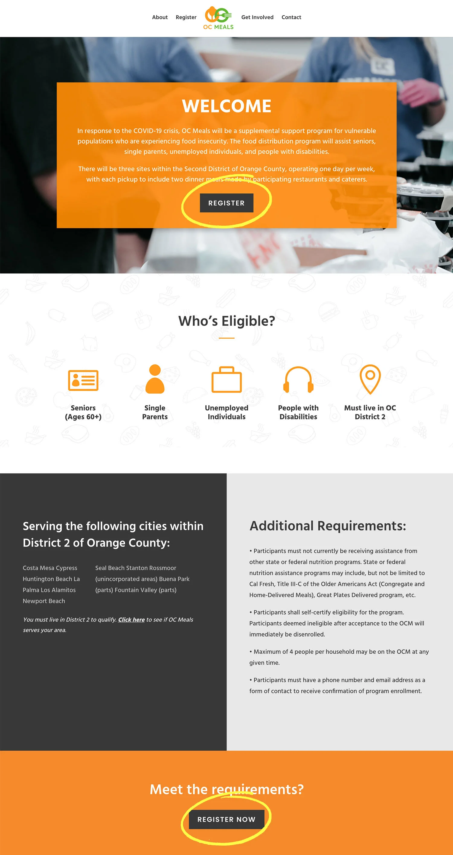
“REGISTER” BUTTON
The placement and wording for this button was a great dilemma for me. I conducted several user surveys to test whether “Register,” “Sign Up,” or “Get/Find/Pick Up Food” (inspired by my competitor analysis) would be the best call-to-action. All of my users chose “Register” as the best-sounding call-to-action.

I was also debating between placing the “Register” button at the top on the Welcome slider, or omitting it until halfway down the page when the user had at least read the necessary requirements to be eligible to apply. I wanted to avoid the user from clicking “Register” right away, only to find out that they were ineligible.
In my user journey map, I had anticipated 3 red-route scenarios:
The user arrives onto the homepage, sees the call-to-action button right away and proceeds to click on it, thereby missing out on all need-to-know information below the slider. This means I would have to reiterate important information on the homepage onto the subsequent Registration page as well to ensure that the user sees it before starting the application.
The user arrives onto the homepage, doesn’t see a button to sign up just yet, which directs them to continue scrolling through the website to see eligibility requirements, and then a call-to-action appears after they have read everything.
The user arrives onto the homepage, sees the call-to-action button right away, ignores it to continue scrolling to see the rest of the website before either scrolling back up to the call-to-action button OR encountering another call-to-action that shows up after the need-to-know information.
For our first prototype, we used the version in which the “Register” button would be omitted from the Welcome slider and tucked under “Application Requirements,” which is the last section the user would need to read before proceeding with the application.

ACCESSIBILITY
Accessibility was an extremely important area for me during the development of this website. We were dealing with a lot of different user groups, among those people with disabilities. The two things I was able to at least control were:
1) Inform users who needed additional help with the application that they could contact us at our email or phone number
2) The visual design in terms of contrast and legibility

With our time constraints, I knew I wouldn’t have enough time to conduct additional user research to look into more robust methods that could specifically cater to more areas of accessibility.
As a compromise, I based my design strategy around keeping the aesthetic as minimalistic as possible, with large fonts, and high contrast between text and the background. I debated a lot with using white font on orange background, since that wasn’t very high contrast, but I was seeing few options where I could play with the branding colors that didn’t involve black, gray, or white. Most of the website was already neutral and I inserted the bright colors as accents and refrained from using them as backgrounds against large bodies of text or thin fonts as much as possible.

USER TESTING

Our first live prototype of ocmeals.com
We conducted user testing on our staff first and received all positive reviews. The one area I felt could be improved for users was allowing for visibility of system status, at the point where they received a confirmation email that their application has been submitted successfully.
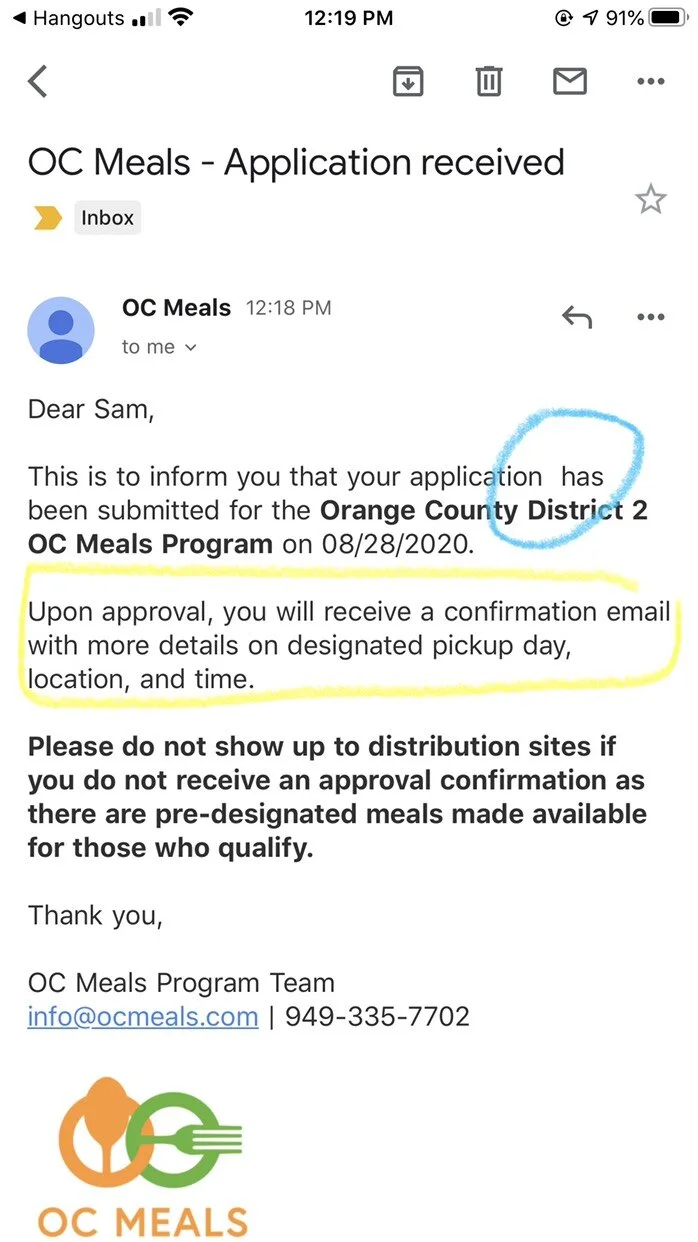
The confirmation email did not provide information to the user about how long they were expected to wait until the next communication from us, so we quickly remedied the confirmation email to inform users that the next email with information about their pick-up date, location, and time should take approximately 2 business days.
IMPACT
After our first round of user testing, we sent the website into the real world the first week of September. We received lots of positive feedback on the program as well as the website’s visual design and overall interface.
I interviewed my project manager as well as event coordinator about feedback they were receiving from users through the hotline and at on-site distribution. I was particularly concerned about whether the colors on the site were at all hard to read for any users.
Crazily, I discovered that since we chose not to place the call-to-action button in the top half of the homepage, the senior group was having trouble finding the “Register” button.
ITERATIONS
I was glad to have these nuggets of information to work with from our participants, so that I could improve the site’s usability and make their application process faster and easier. My most recent iteration to the site was to not only place the call-to-action button back onto the homepage slider, but also rearrange the second call-to-action into a section of its own underneath the halfway point of the website (where users are presumed to have finished reading all the requirements).
I also reversed the colors of the blurb on the homepage slider, which was previously white text on orange, to white text on dark grey currently. The call-to-action doubly stands out as an orange button.
After another week of live user testing, I received reports from the event coordinator that calls and questions from participants related to “Where do I register? Where is the application?” have ceased.
